What did I expect from this project?
I felt very ambitious for this project at the start, and I had a lot of initial ideas for this project. I suppose I was very excited about the creativity that was going to be in this project. I think I got a bit carried away with my ideas, and, while I still think these are very good ideas that I had for my game, I think I should have considered the time in which we not only needed to create the game, but also learn how to build a game using Unity. I also should have considered my current ability, which was practically at a beginner standard, because before this project I had very little experience using Unity.
What did I enjoy?
I enjoyed the creativity of designing my game and I felt that this project helped me to see the both creative and technical processes gone into games design in the real world. I also enjoyed finding things like sounds from the internet, and some sound effects were actually from my favourite games from my childhood, so I felt like I was able to put a personal flavour in my game, not only with the sounds, but most other things as well. I also found the project mostly genuinely interesting as I am very interested in video games, and could be said as the main influence I chose to do Interactive Media at college.
What didn't I enjoy?
I felt that this project was a bit rushed, and I sometimes struggled to keep up with all of the technical things we were learning and needed them repeating to me so I knew what I was doing. I also found a lot of the scripting and a lot of things with how to use Unity a bit confusing at first, and I didn't always understand these things completely.
What have I learned that will be useful in the future?
I feel I have learned a lot about how casual and internet games are made, and I've also learnt a lot of technical skills, which hopefully will affect the quality of my work in the future. As noted earlier, I also enjoyed choosing sounds for my game, even though I know that wasn't the most important thing I did in this project, but it was certainly one of the more enjoyable parts for me.
How could I improve?
I feel I could improve by improving my ability on Unity and always check what is expected of me. I also need to be clear about what I'm doing and also to make sure I understand completely what I need to do. I also think I need to take into account my abilities, so I know what's within me, and what's within reach of me, and what's beyond my reach at my current ability. I also feel I need to learn to cope better and not get stressed about work and to be relaxed with what I'm doing.
If I did a similar project in the future, would I do things differently? How?
I would try to learn the limits of what I could achieve as soon as possible, with the time given. This would help me not to get stressed about the work, as well as... I also think I expect too much from myself, and I must admit I often tend to compare myself to other people, and sometimes feel like what I'm doing may not be good enough. I just hope it is good enough. At least I did my best, and at the end of the day, that's all I can do.
Is there anything I didn't know how to do that felt I needed to know?
When I completed my game, and I know we went through this, but I forgot how to change the colour of the text to indicate it is highlighted by the cursor. I also only wanted to have the cursor hidden in my actual game and not the start/end menus, and couldn't figure out how to do this. Pretty pleased with the actual gameplay of my game, even though I felt like I wanted more control of how the main camera/weapon rotated, so it didn't rotate 360 degrees. I also had a problem with the 'Win' screen. Once you won once, when you clicked to play the game again, it would automatically go to the 'Win' screen again without actually playing the game again, which was a problem. I just hope it's okay.
How did I feel my final game turned out in the end?
Apart from the issues listed above, I felt my game turned out very well. I'm very happy with my models, and I was surprised with how well the animations managed to turn out. I am also very pleased with the overall gameplay and controls, which, in my opinion, is the most important aspect of a game.
Summary/Personal Comments.
Overall, I felt like it was an interesting project which I felt I learned a lot from, not only with technical and creative things, but I also have learned a bit about myself and how I work and how people around me work. There were a lot of things in this project that I found difficult, and caused me to get very stressed at times, and I feel I would benefit from help to manage stress and work, and a lot of other things which I won't mention here which I'll need help with, as they're not really relevant to the project. Having said that, I have had some amazing help from this project, I have done all the work myself, but just with helping me to organise my work and to reassure me at times, and also to help me with how to do some things I was struggling with. I am very pleased with the overall outcome of this project, which I feel I have put a lot of hard work into, and am very satisfied with it.
Tuesday, 25 October 2011
Sunday, 23 October 2011
How I Managed to make my game.
Ok, I will try to explain how I created my game as well as I can, which might be tricky to understand.
First of all, I had to create a setting for my game. To do this, and also because my game is set in outer space, All I felt I needed was a few simple boxes for the "walls" (which I used the starry texture that I used for the UFO window and the planet rings) and floor, which I used a crater texture for. I also built a wall in the middle of my stage, and applied a rocky texture to it, which is very similar to, if not the exact same as my space rock texture I used for my not exploding planet. I also wanted to add a Skybox which I think was in the "Edit" menu, and I added the sky texture I wanted. Although first I had to insert the Skybox textures package that is built in to Unity, and then choose the texture I wanted, in this case, it was a starry sky, to match my space theme.

Next, it was time to import my 3D Models into the game. I started with importing my weapon I was going to use and making sure that worked fine before working on the targets. I also had to create a bullet for my gun (for this, I just created a small sphere, since I didn't really think it would matter too much what my bullet looked like since it would be moving so quickly and I would have hoped people would focus more on the gameplay than anything else.) For the bullets to work, I had to attach a few scripts to the bullet, so that they would disappear on contact and also destroy things that come into contact with the bullet, and make sure people couldn't really see the solid bullet in front of the screen. I also had to attach my gun model to the main camera, so it follows the main camera.
After my weapon was all sorted, I added a few of my targets. Because I was thinking I had loads to do before my game was complete, I was advised to only import 4 targets for the time being, so, if I ran out of time, at least I would have a working game with a few targets. After importing these targets, I had to attach target scripts to each of my targets, so they would explode and get "killed" when they collided with the bullets. I also wanted to add an explosion effect after each of my targets got destroyed, so I used an explosion package for Unity and chose an explosion I felt was appropriate.
Next, I needed to animate the targets. I first had to watch a video on YouTube before I could start animating my targets so I actually knew how to animate the targets. I found this video very informative, clear, thorough and useful in how to animate things in Unity. After that, I surprised myself with how quickly I managed to pick up how to animate my targets. At this point I decided to add a few more targets to my shooting scene I actually enjoyed animating my targets, and I was really surprised about how creative I found animating in Unity. Despite me struggling with animating a few of my targets, because some of the animating pegs were quite far apart, I felt quite comfortable with how most of my models had been animated.
http://www.youtube.com/watch?v=dHuaXzgv23A&list=FLzRu0iYEfpNZkqrpiszGkdQ&index=9
This video helped me immensely with animating my targets, and developing my entire game. Many thanks to this guy!
After all of this, I decided to look for some appropriate sound effects and some background music for my game. I found this quite exciting, but I knew I couldn't spend ages looking for the perfect sound effect, since I did need to complete my game. Having said that, I feel very happy with the sound effects I managed to choose, and I felt I found some very appropriate background music.
http://www.youtube.com/watch?v=tB1Z338gcsU
Background music for my main game. I felt this sounded very appropriate and definitely sounds like it's meant to be from a sci fi game setting.
After I had done this, I had to learn how to put a timer into my game, so my game has a time limit to destroy all the targets. To do this, I had to use a timer script and I also had to create two alternate end scenes; A Win scene (for when you destroy all the targets within the time limit) and a Lose scene, where you fail to shoot all the targets in the time limit, so the game will have somewhere to go to when it ends. For this I also had to add sounds/background music for these end scenes, and I also wanted to use a more interesting looking font than the default font (Arial). I ended up using a Batman themed font for my game, as I felt it matched the theming of my game very well and I felt it was a very nice looking font, basically.
http://www.youtube.com/watch?v=_RmC6aF4WjY&list=FLzRu0iYEfpNZkqrpiszGkdQ&index=2
A sound effect I used for my Fail scene, which is from a game I remember playing a lot in my childhood, Crash Bash (PS1)
After this, I felt I had a very good working game! Just needed to create a start screen and then my game was complete!
First of all, I had to create a setting for my game. To do this, and also because my game is set in outer space, All I felt I needed was a few simple boxes for the "walls" (which I used the starry texture that I used for the UFO window and the planet rings) and floor, which I used a crater texture for. I also built a wall in the middle of my stage, and applied a rocky texture to it, which is very similar to, if not the exact same as my space rock texture I used for my not exploding planet. I also wanted to add a Skybox which I think was in the "Edit" menu, and I added the sky texture I wanted. Although first I had to insert the Skybox textures package that is built in to Unity, and then choose the texture I wanted, in this case, it was a starry sky, to match my space theme.

The Crater texture I used in my game
Next, it was time to import my 3D Models into the game. I started with importing my weapon I was going to use and making sure that worked fine before working on the targets. I also had to create a bullet for my gun (for this, I just created a small sphere, since I didn't really think it would matter too much what my bullet looked like since it would be moving so quickly and I would have hoped people would focus more on the gameplay than anything else.) For the bullets to work, I had to attach a few scripts to the bullet, so that they would disappear on contact and also destroy things that come into contact with the bullet, and make sure people couldn't really see the solid bullet in front of the screen. I also had to attach my gun model to the main camera, so it follows the main camera.
After my weapon was all sorted, I added a few of my targets. Because I was thinking I had loads to do before my game was complete, I was advised to only import 4 targets for the time being, so, if I ran out of time, at least I would have a working game with a few targets. After importing these targets, I had to attach target scripts to each of my targets, so they would explode and get "killed" when they collided with the bullets. I also wanted to add an explosion effect after each of my targets got destroyed, so I used an explosion package for Unity and chose an explosion I felt was appropriate.
Next, I needed to animate the targets. I first had to watch a video on YouTube before I could start animating my targets so I actually knew how to animate the targets. I found this video very informative, clear, thorough and useful in how to animate things in Unity. After that, I surprised myself with how quickly I managed to pick up how to animate my targets. At this point I decided to add a few more targets to my shooting scene I actually enjoyed animating my targets, and I was really surprised about how creative I found animating in Unity. Despite me struggling with animating a few of my targets, because some of the animating pegs were quite far apart, I felt quite comfortable with how most of my models had been animated.
http://www.youtube.com/watch?v=dHuaXzgv23A&list=FLzRu0iYEfpNZkqrpiszGkdQ&index=9
This video helped me immensely with animating my targets, and developing my entire game. Many thanks to this guy!
After all of this, I decided to look for some appropriate sound effects and some background music for my game. I found this quite exciting, but I knew I couldn't spend ages looking for the perfect sound effect, since I did need to complete my game. Having said that, I feel very happy with the sound effects I managed to choose, and I felt I found some very appropriate background music.
http://www.youtube.com/watch?v=tB1Z338gcsU
Background music for my main game. I felt this sounded very appropriate and definitely sounds like it's meant to be from a sci fi game setting.
After I had done this, I had to learn how to put a timer into my game, so my game has a time limit to destroy all the targets. To do this, I had to use a timer script and I also had to create two alternate end scenes; A Win scene (for when you destroy all the targets within the time limit) and a Lose scene, where you fail to shoot all the targets in the time limit, so the game will have somewhere to go to when it ends. For this I also had to add sounds/background music for these end scenes, and I also wanted to use a more interesting looking font than the default font (Arial). I ended up using a Batman themed font for my game, as I felt it matched the theming of my game very well and I felt it was a very nice looking font, basically.
http://www.youtube.com/watch?v=_RmC6aF4WjY&list=FLzRu0iYEfpNZkqrpiszGkdQ&index=2
A sound effect I used for my Fail scene, which is from a game I remember playing a lot in my childhood, Crash Bash (PS1)
After this, I felt I had a very good working game! Just needed to create a start screen and then my game was complete!
Design Development: 3D Models
Now that I had drawn my initial ideas for potential targets and weapons that I may want to include in my game, it was now time to create the 3D models for my game. I used the program Autodesk Maya to create my 3D models for my weapons and targets.


These are the models I have created myself using Maya without textures

I wanted to keep the alien quite simple, and I chose to just have 1 alien design and maybe add a few colour variations later on.

The planet model is probably one of my favourites. I basically made a sphere in Maya and extruded the middle (which, in Maya terms means to drag a shape out to change it, if that makes sense.)

This would be the 3D model of my "Power Stars," which would serve as power ups for my game. I really enjoyed making this model and I am very pleased with how it looks.

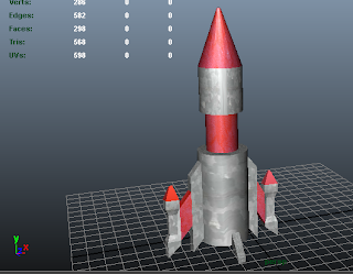
The 3D model for my Rocket was the first model I created for this game. It's not a perfect model, I probably should have used cylinders for the side engines instead of extruding from the main body, but all in all, I'm quite pleased with this model.
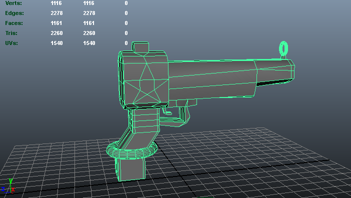
This was probably the hardest of the lot. I just really wanted a handgun for this game, because the theme park rides which I was thinking of basing my game on when I was doing my research for this game usually use laser handguns. I also added extra vertices to the model and tried to move them around to make a shooting star pattern on the gun. I am actually very pleased with how I've managed to create this from scratch

For my UFO model I used a sphere and messed around with the shape, like deleting part of the shape and extruding the middle of the sphere. Similar to how I made the planet, but with half of the planet chopped off, basically. I'm excited about texturing the model.
Due to time restrictions I really only wanted to keep things simple with the models and to try not to use too many extravagant textures and I didn't want to spend too long on searching for/creating textures for my models.
I have found some brilliant textures that I think will go really nicely with my models. Listed below are a few examples of some of my favourite textures I found for this project I have decided to use.

Really nice scaly texture, will work very well with the aliens, and I have created different colour variations of this texture in Photoshop

This is one of my favourite textures I have found. I love the exploding planet feel that this texture is suppose to represent and it is represented brilliantly. The perfect texture for my planets

Really nice starry background, and would also make a great texture for a intergalactic background and maybe in a couple of other textures

I changed the starry texture above to a more brown-ish colour, so it matches the stone texture (below) better for the ring around the planet.

A very space like texture for planets or asteroids. Will work very well as a planet variation.
In Maya I selected for most, if not all of my models to have a Blinn type texture (which is a shiny texture map, as opposed to a Lambert texture, which is a solid, non shiny texture), and assigned the different textures to the relevant parts of the models.
What my 3D models look like with textures

Really pleased now with how the UFO looks now I've added textures. Think the metallic texture works really well and I like how well I've managed to size the texture. I added the starry texture to the window of the UFO to make it try to look like it is reflecting the stars in outer space.


My two different texture variations of my planet targets. I think the textures on both models have worked especially well, particularly the first one, which I have to say is probably my favourite of all the textures.

Blue alien (lets call him, say, Bluey)

Mr Green Alien

Pink alien

Purple Alien

Yellow alien
Think the scaly texture and all the different colour variations of it have worked quite well. I must say it was quite fiddly and time consuming making all the textures face the right way. Also, at first, I wasn't too sure which parts would require the scale texture, such as the sides of the alien and the spikes. Also decided to just use a solid colour texture for the mouth and the holes of the aliens so the monster wasn't all scales, I guess. Also indicates where eyes, moth and holes are on model.

Really like the metallic red contrast the rocket has to the normal grey metal looking texture. I think red was probably a very good colour choice. It is the colour of fire, and I decided to name my rocket the FIREROCKET!

This (again) was probably the hardest (to texture), because of all the different faces the model has, but I am really pleased with the texturing. Think the shooting star pattern I was hoping to apply onto the gun really worked well. If everything went to plan the light grey parts would light up depending on if a power up was obtained.
I also had textured my Power Stars and had also made a few other models, such as asteroids and comets, using the same textures I used for my planets, but I was told I had to keep things as simple as I can. This advice helped me a lot and relieved me of a lot of stress, so I could focus more on how my game was going to work, and to learn the techniques I needed to know to create my game.
Now, after I had modelled all of these models and textured them, it was time to upload them onto the game engine Unity! To do that, I had to convert my Maya file into an FBX file, so the textures would stay on the model when I imported them onto Unity. To do this, this website helped me to show me how to export Maya files into FBX files, ready to import into Unity.
Sunday, 2 October 2011
Design Development
Using the ideas from my initial ideas, I have started to create the contents of my game, by starting to draw them.
Weapons
For my weapon I think I will include a ring around it that will change colour depending which power up is equipped to it. I also think that looking at weapons from theme park rides will also help me to think of a design for my initial weapon.


Weapons from theme park rides
http://www.birminghammail.net/birmingham-videos-pictures/birmingham-picture-galleries/2009/10/20/scarefest-09-at-alton-towers-resort-97319-24973122/
http://liveyourtraveldreams.blogspot.com/2010/10/buzz-lightyears-space-ranger-spin.html

General Electric Minigun (Predator)
http://10dots.wordpress.com/2008/09/23/10-top-weapons-from-sci-fi/
Surprisingly, my favourite of these weapons has to be the one the zombie statue is holding outside of Duel. I like how, despite the slightly old fashioned and scary theming, they have managed to create a very modern weapon. I also like the red lights on the weapon, and I also think that black and red go really well together, and is something I should consider when creating my weapon. I think the General electric Minigun also features some good and creative ideas as well.
Power Ups
These will all have different effects depending on what colour the Power Star in my game is. These will all have different effects, and the ideas from these effects have mainly come from games that I have played myself, not necessarily shooting games, but games such as Mario Kart as well. I have also used the Sniper idea I got from the internet game Urban Sniper 2 and Sniper Assassin 5 from my research to create a power up.
Ideas/Inspirations for some of these Power Ups:
Green: Cracker Launcher (Super Smash Bros. Brawl, Nintendo Wii)


http://www.smashbros.com/en_uk/items/item02.html
Pink: Sniper Assassin 5 and Urban Sniper 2


http://www.freeonlinegames.com/game/urban-sniper-2.html
http://www.addictinggames.com/shooting-games/sniper-assassin-5-final-mission-game.jsp
Yellow: Link's Crossbow Training (Nintendo Wii)


http://www.nintendo.co.uk/NOE/en_GB/games/wii/links_crossbow_training_9082.html
http://uk.wii.ign.com/articles/836/836867p1.html
Purple: Red Shell (Mario Kart series)
http://www.nintendojo.com/features/specials/the-best-and-worst-mario-kart-items
Initial Drawings for Power Ups and Weapons


Weapons
For my weapon I think I will include a ring around it that will change colour depending which power up is equipped to it. I also think that looking at weapons from theme park rides will also help me to think of a design for my initial weapon.
Weapons from theme park rides
http://www.birminghammail.net/birmingham-videos-pictures/birmingham-picture-galleries/2009/10/20/scarefest-09-at-alton-towers-resort-97319-24973122/
http://liveyourtraveldreams.blogspot.com/2010/10/buzz-lightyears-space-ranger-spin.html
General Electric Minigun (Predator)
http://10dots.wordpress.com/2008/09/23/10-top-weapons-from-sci-fi/
Surprisingly, my favourite of these weapons has to be the one the zombie statue is holding outside of Duel. I like how, despite the slightly old fashioned and scary theming, they have managed to create a very modern weapon. I also like the red lights on the weapon, and I also think that black and red go really well together, and is something I should consider when creating my weapon. I think the General electric Minigun also features some good and creative ideas as well.
Power Ups
These will all have different effects depending on what colour the Power Star in my game is. These will all have different effects, and the ideas from these effects have mainly come from games that I have played myself, not necessarily shooting games, but games such as Mario Kart as well. I have also used the Sniper idea I got from the internet game Urban Sniper 2 and Sniper Assassin 5 from my research to create a power up.
Ideas/Inspirations for some of these Power Ups:
Green: Cracker Launcher (Super Smash Bros. Brawl, Nintendo Wii)
http://www.smashbros.com/en_uk/items/item02.html
Pink: Sniper Assassin 5 and Urban Sniper 2
http://www.freeonlinegames.com/game/urban-sniper-2.html
http://www.addictinggames.com/shooting-games/sniper-assassin-5-final-mission-game.jsp
Yellow: Link's Crossbow Training (Nintendo Wii)
http://www.nintendo.co.uk/NOE/en_GB/games/wii/links_crossbow_training_9082.html
http://uk.wii.ign.com/articles/836/836867p1.html
Purple: Red Shell (Mario Kart series)
http://www.nintendojo.com/features/specials/the-best-and-worst-mario-kart-items
Initial Drawings for Power Ups and Weapons


I thought that, using some ideas from games that I've seen and played, I would create some power ups which have different effects depending on which colour they are, and will slightly alter how my weapon looks. How I would want the power ups to affect my weapon is to not change its appearance entirely, but change the colour of different parts of my weapon, such as the shooting star design on the gun and the ring around the grip of the gun, depending on which power up you have acquired.
I found it hard to create a weapon for my game, because to be honest, I don't really know much about how weapons should look and work, hence why I've had to research a few different weapons before drawing an idea for my weapon.
Initial Drawings of Targets etc.


I got some ideas for targets when writing my initial game synopsis and used some images I found to create a different variety of targets. Looking at what I have created, I feel I have created a variety of targets, but I'm not entirely sure if I'm missing anything from outer space. I may have enough for the time being, as I will only have another 3 weeks to finish and complete everything in my game.
Other potential idea sources for targets:
Other ideas for my game
- Could have spacecraft and planets occasionally obstructing part of the screen and would have to destroy them. They would be worth lots of points.
- Would have to destroy a planet's rings before you can destroy the planet itself.
Images that may help me to create other game aspects:
This image should help me to create a black hole which appears when you shoot a black Power Star (see above)
Initial sketches for backgrounds


Stars will act as cursors for where you would be shooting.
Round edge around screen possibly indicates that the player could be shooting from a rocket. I am currently undecided on this idea.
I drew all of these images before creating my weapons for this game, so that's why the weapons don't appear on these drawings. I also wanted to keep the background drawings separate from the target drawings so I don't get confused when creating the background and targets using Unity and Maya, and that I will have a clear resource to work from when creating my background.
Starry backgrounds with different colours
Not only do these backgrounds look nice and could inspire my final background for my game, it also gives me an idea, when each level, or everytime you play the game, the background changes colour. This feature reminds me of a game/app called Pop, a game developed by nnoooo studios, a time based game which sees the player basically pop bubbles to score points, but they are punished if they miss bubbles or pop certain bubbles. In this game the background and the bubbles always change colour when completing a level, or 'wave.' I feel that this would be a great idea for my game, to offer the player a very exciting change of scene when they play the game.
Pop logo and screenshots, showing the change of background and bubble colours that occur in each level.
Possible influences for my Background
I think that these backgrounds are very pretty and look absolutely amazing, and I would be very pleased if I had something like this for my background in my game. However, I do feel that I would like something else in my background, like a planet and/or a sun. Something like that.
I really admire the colours that are used here, and I like the effect used to create the planet in the background. However, I feel that this is far too busy with the buildings/debris/not sure what they are or what their purpose is, in fromt of the planet and I honestly feel that this ruins the image a bit. Reminds me of a game level in the Kingdom Hearts series, The World That Never Was, because that had a very strange and busy structure.

The World That Never Was, Kingdom Hearts (http://kingdomhearts.neoseeker.com/wiki/The_World_That_Never_Was)

http://onlyhdwallpapers.com/tag/points
I do really like this image, kind of reminds me of the Lion King opening scene. I don't think I could use the hill idea, even though this is a great image. I also like the colours used and the silhouette effect here as well. It also reminds me a bit of an apocolypse, which isn't good...

http://good-wallpapers.com/space/921
I think the position of the planet in the background is positioned perfectly. I also like how everything in this background are all similar colours. This would work well so people could distinguish targets and their crosshairs very easily and won't get lost in such a busy background, like the purple one that has a lot of unnecessary structures in the background

Cross-hairs
Cross hairs are the cursor that you control in one of these shooting games. I have had a distinct idea for what I'd like my cross hair for my game to look like, I'd like my cross hair to be star shaped.
Cross Hair images
http://www.streamhead.com/how-to-use-images-in-actionscript-3-with-flashdevelop-and-some-other-as3-tips/
I really like how simple and friendly this cross hair looks, and it isn't too distracting for the user. You can also easily tell where abouts you're aiming and shooting with this crosshair example, due to its simplicity.

http://blogs.independent.co.uk/2011/01/13/ready-aim-roll-vt/
As with the previous image, where you're aiming with this crosshair is easily marked, but with this one, I feel is more specific with where you're aiming, but a lot less creative. This does look more like a traditional cross hair.
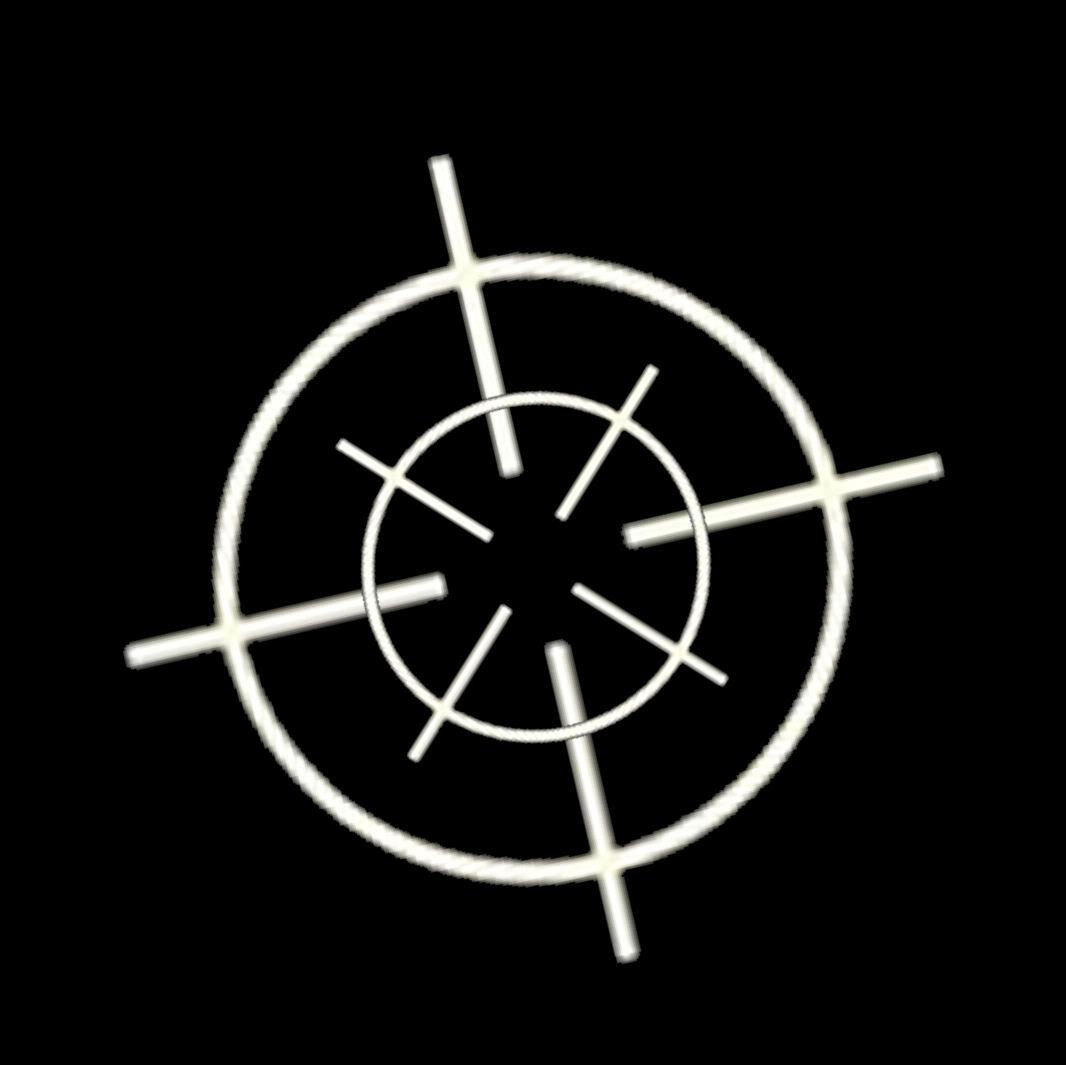
http://s292.photobucket.com/albums/mm10/calopcia/?action=view¤t=crosshair4.jpg&newest=1
Again, this is more specific with where the crosshair is aiming than the previous crosshairs we have seen, but I feel with this one, there may be just too many lines, which with some of them, such as the diagonal lines cutting through the inner circle of the crosshair, don't really seem necessary to me.

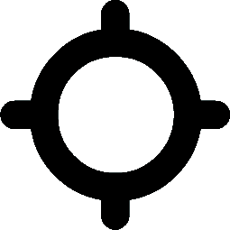
http://www.clker.com/clipart-cross-hair-target.html
Compared with the rest of the crosshair designs we have seen, this is probably my least favourite. I don't really like all the lines marking the cross, and the diagonal lines look a bit like pins, and, as with the previous cross hair image, the diagonal lines don't really seem necessary. However, I feel this would be a good design if you were to see the barrel of the gun onscreen, because this isn't really too distracting, despite all the lines used to create this cross hair example.

This is the cross hairs I created using Adobe Illustrator and Photoshop, and I would like to use this in my final game. I am very pleased with how the design has worked, and I'm so glad with how creative this looks.
The World That Never Was, Kingdom Hearts (http://kingdomhearts.neoseeker.com/wiki/The_World_That_Never_Was)
http://onlyhdwallpapers.com/tag/points
I do really like this image, kind of reminds me of the Lion King opening scene. I don't think I could use the hill idea, even though this is a great image. I also like the colours used and the silhouette effect here as well. It also reminds me a bit of an apocolypse, which isn't good...
http://good-wallpapers.com/space/921
I think the position of the planet in the background is positioned perfectly. I also like how everything in this background are all similar colours. This would work well so people could distinguish targets and their crosshairs very easily and won't get lost in such a busy background, like the purple one that has a lot of unnecessary structures in the background

After researching some sci fi/intergalactic backgrounds that may influence my background design for my game, I drew this image, inspired by a lot of these examples. I am really happy with this design, with a planet in the background, and I don't think it looks too busy or distracting. I also want everything in my background to be a similar colour, so that it doesn't distract the player from the objective of the game. I'd also like some sort of fog effect on the ground, which I hope could be in a Unity package.
I'm very pleased of how much detail I've managed to get onto Planet Background, and I also think the ring around the planet gives it character.
However, I don't think the stars will be as big as I've drawn them on this image. I possibly drew them that size so people would know what I was trying to draw. I will make them smaller when I come to create my game.
Cross-hairs
Cross hairs are the cursor that you control in one of these shooting games. I have had a distinct idea for what I'd like my cross hair for my game to look like, I'd like my cross hair to be star shaped.
Cross Hair images
http://www.streamhead.com/how-to-use-images-in-actionscript-3-with-flashdevelop-and-some-other-as3-tips/
I really like how simple and friendly this cross hair looks, and it isn't too distracting for the user. You can also easily tell where abouts you're aiming and shooting with this crosshair example, due to its simplicity.
http://blogs.independent.co.uk/2011/01/13/ready-aim-roll-vt/
As with the previous image, where you're aiming with this crosshair is easily marked, but with this one, I feel is more specific with where you're aiming, but a lot less creative. This does look more like a traditional cross hair.
http://s292.photobucket.com/albums/mm10/calopcia/?action=view¤t=crosshair4.jpg&newest=1
Again, this is more specific with where the crosshair is aiming than the previous crosshairs we have seen, but I feel with this one, there may be just too many lines, which with some of them, such as the diagonal lines cutting through the inner circle of the crosshair, don't really seem necessary to me.
http://www.clker.com/clipart-cross-hair-target.html
Compared with the rest of the crosshair designs we have seen, this is probably my least favourite. I don't really like all the lines marking the cross, and the diagonal lines look a bit like pins, and, as with the previous cross hair image, the diagonal lines don't really seem necessary. However, I feel this would be a good design if you were to see the barrel of the gun onscreen, because this isn't really too distracting, despite all the lines used to create this cross hair example.

This is the cross hairs I created using Adobe Illustrator and Photoshop, and I would like to use this in my final game. I am very pleased with how the design has worked, and I'm so glad with how creative this looks.
Subscribe to:
Posts (Atom)